- Call Us : (+91)76694 09022
Press 1 (For International Conferences with Journal Publications)
- +91 8122268465
- icraeca@iferp.net
As an oral presenter, you can deliver your presentation live to an audience effectively and engage in fruitful discussions with the audience. The registration fee packages present many benefits to oral presenters.

Consider the sequence and relevancy of your slides. A current slide should build a path to next slide.
Use graphs and charts to illustrate your prominent points. They will help the audience to clearly understand the content.
Make it simple. Too much fancy graphs and charts with huge data and numbers will confuse the audience. Don’t use flash, gif images and fancy colors. The audience will only remember those effects, not your message. Make it simple!
Use the 6-6-6 rule: (maximum 6 words per bullet, maximum 6 bullets per slide, and maximum 6 text slides in a row). The fewest words with effective imagery will have the most powerful effect.
Use high-contrast, easy-to-read fonts that are common to most computers. Do not use ALL CAPS, italics, and other enhancements that clutter and distract. A good guideline is a minimum of 30-point font.
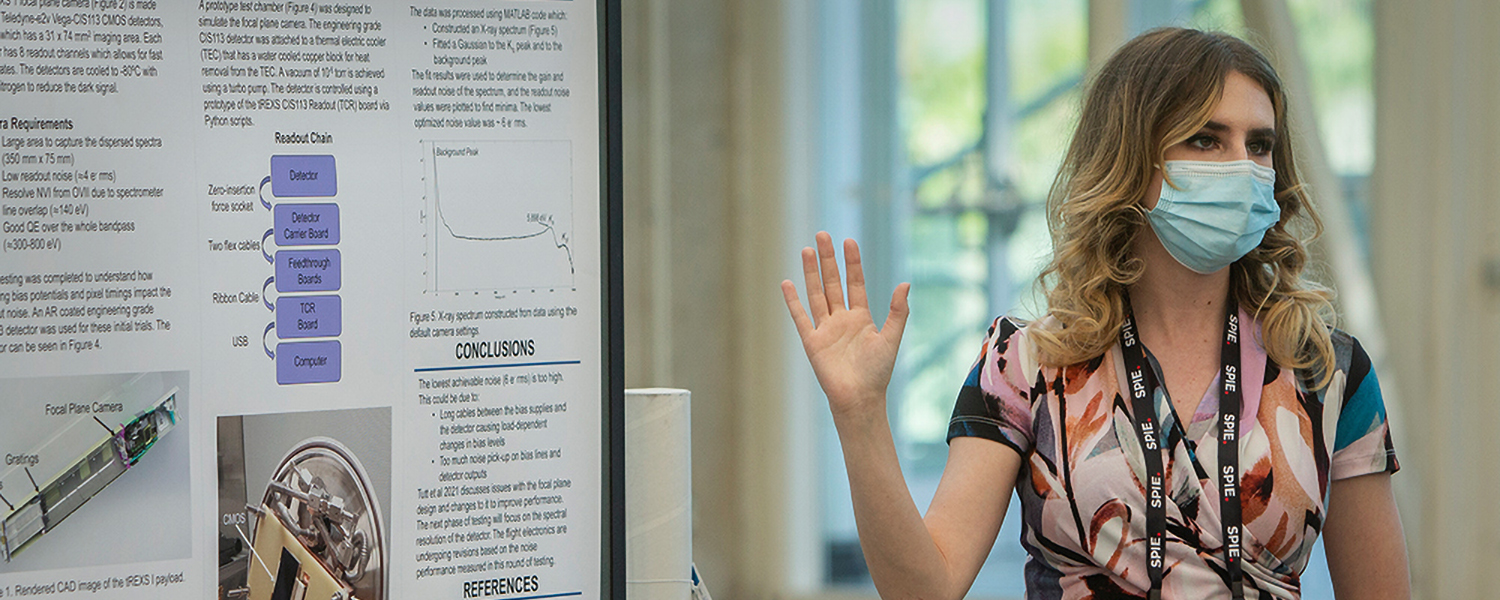
As a poster presenter you can deliver your presentation effectively to an audience in the form of a poster.
There is no formal oral presentation in a poster session, instead each author is assigned a display area on which diagrams, graphics, data, pictures/photos, and a small amount of text are presented.
The poster should be self-explanatory, but the author should be available at certain times, such as refreshment breaks and during the time devoted to poster session, to interact with viewers and answer questions.

Entice audiences to read about your work.
Help audiences understand and remember the information presented.
Ensure important information is readable from about 10 feet away.
Keep the title short and attention-grabbing.
Aim for a word count of about 300 to 800 words.
Make the text clear and concise.
Use bullets, numbering, and headlines for easy readability.
Utilize graphics, colours, and fonts effectively.
Preferable 4*3 ft.
Steps to Designing a Poster:Step #1: Identify the Purpose of Your Poster.
Step #2: Choose a Poster Template.
Step #3: Add Your Text Content.
Step #4: Incorporate Photos and Graphics.
Step #5: Customize Colors and Fonts.
Clear, uncluttered design with a pop of color.
Present information in a logical order for easy navigation.
Avoid overwhelming text and include only essential information.
Use visual aids such as charts, graphs, and images.
Title: Catchy and informative.
Graphics: Relevant visuals supporting your message.
Text: Limit the use of three font sizes; largest for title, second largest for
section titles, and smallest for main text.
White Space: Allow for visual breathing room and prevent clutter.
T Begin with a "1 Minute Pitch" to capture audience interest.
Introduce yourself, the project, and spark a dialogue.
Encourage questions and discussion.For designing your poster, you can utilize tools such as Canva, PowerPoint, Adobe Spark, Piktochart,
PosterMyWall, Smore, Desygner, or CorelDRAW. These tools provide templates and customization
options to create visually appealing and effective posters.
Remember, an effective poster combines a visually pleasing design with concise and engaging content
to attract and inform your audience effectively.
For your convenience, we offer virtual presentations if you are unable to attend the conference in person but still need your work to be presented and published. There are two different types of virtual presentations.
Live Video Presentation
Power Point Virtual Presentation

Select the ideal background, then optimise the lighting.
Make sure your PC is directly connected to your modem with an Ethernet connection.You'll get the best signal and the most reliable internet connection from doing this.Use the same computer and internet connection for practise as when you really deliver the presentation.
Examine the webcam connection, then go closer so that the camera only captures your face, neck, and shoulders.
Ensure that your voice is clearly audible. External microphones or headphones may perform better than PC audio.
Just as in face-to-face presentations, audiences connect to authenticity, so be yourself when presenting! Allow your personality to shine. Be Yourself and Have Fun.
Perform a test run before the presentation day. Prior to submitting your slides, take the time to review them with a trusted advisor.
Don't read from the slides while giving your presentation; this will cause your audience to lose interest and to forget what you said as soon as it is over.
Look for opportunities to use props, demonstrations, or other resources in order to finish your presentation in the allocated time.
Perfecting a skill requires practise. Consider practising your presentation.